iAspire by accenture.
A dashboard that makes it easy for stakeholders to understand the latest progress on the projects they're responsible for.
While I've provided a concise overview of my project, the specific details are subject to a non-disclosure agreement.
My Role as a Developer

Collaborated with a diverse team of 20: leads, senior and junior devs.

Effectively contributed to delivering user stories across two projects.

Worked closely with UX designers to assess design limitations and feasibility.
What I did and delivered as a developer

Built data-driven websites, primarily focusing on charts using d3 and Apex Charts.

We iterated our code multiple times, incorporating designer feedback.
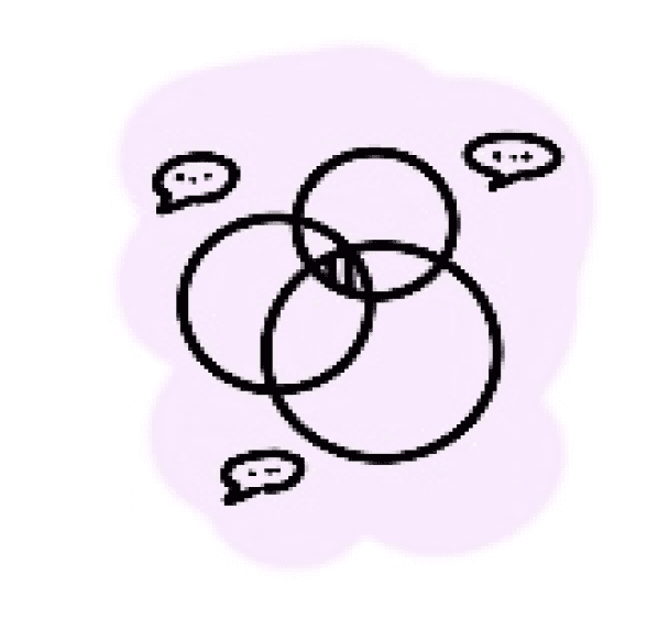
To bridge the gap between developer and designer, we met at a middle ground with the final design.
Why Does Development Involve So Many Iterations?
Data Volume: Design doesn't accommodate large datasets.
Technological Constraints: Adjustments due to technology limitations of the given design.
Time Constraints: Last minute modifications made in the designs.

How can we reduce the iterations?

A Designer who can code play a vital role in reducing iteration
A person with both software engineering and design knowledge would be able to shorten the process as they know the feasibility and limitation better
Some of my work as a developer
USER STORY - 1
The chart layout needs to be modified due to the cluttered alignment of roles as the given design couldn't accommodate the large real time date
we initiated a collaborative effort with the design team to address this issue
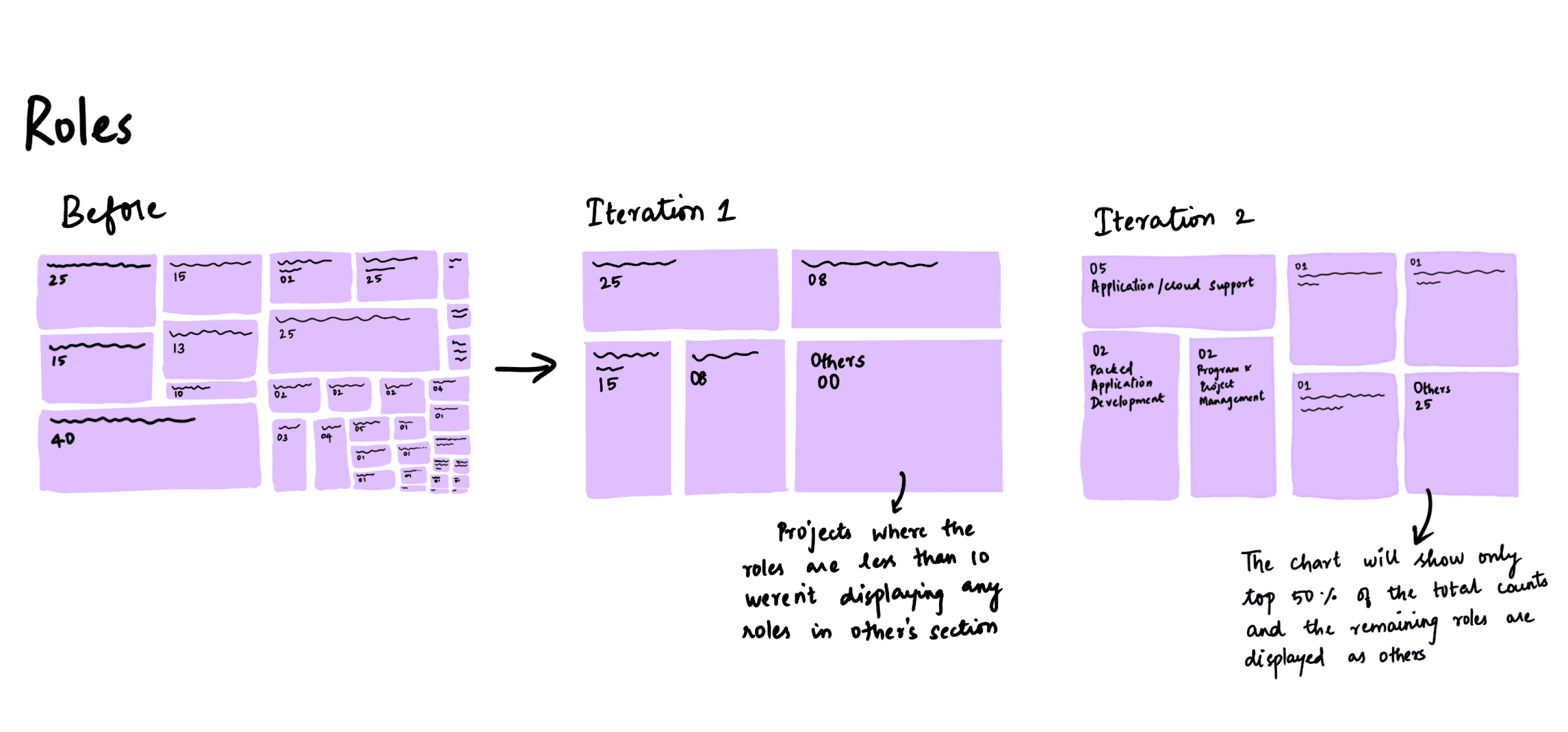
The chart's layout appeared cluttered when real-time data was incorporated.
Iteration 1
we decided to display the top 10 roles based on their count in descending order and place the remaining roles in the "other roles" section.
Limitation on Iteration 1
This approach posed a conundrum for projects with fewer than 10 roles, as the "other roles" section displayed no data.
Iteration 2
we decided to represent the number of rectangle tiles based on the total number of roles and we developed a logic to accommodate the "other roles" for various role count combinations.
To ensure the effectiveness of these iterations, we conducted thorough testing using production data to verify that the chart's display functioned optimally across a range of scenarios.
Key learning from user story 1
Having gone through multiple design iterations, I've learned the importance of analyzing real-time data before starting the design.
USER STORY - 2
The production-deployed chart underwent notable modifications, presenting several alternative designs.
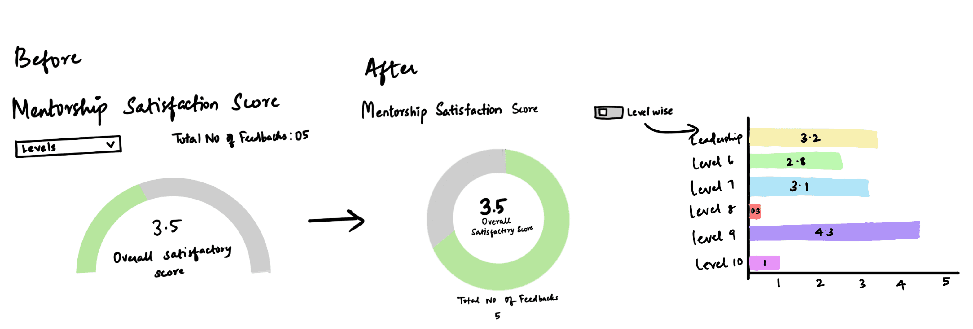
It transitioned from a semi-circular gauge chart to a radial chart.
This alteration simplifies the user experience, allowing users to effortlessly toggle to access level-wise scores.
The user interface element for selecting the level shifted from a dropdown menu to a convenient toggle button.
This alteration simplifies the user experience, allowing users to effortlessly toggle to access level-wise scores.
Key learning from user story 2
Minimizing interactions within an interface leads to a more efficient and user-friendly experience, resulting in increased speed and reduced cognitive load.
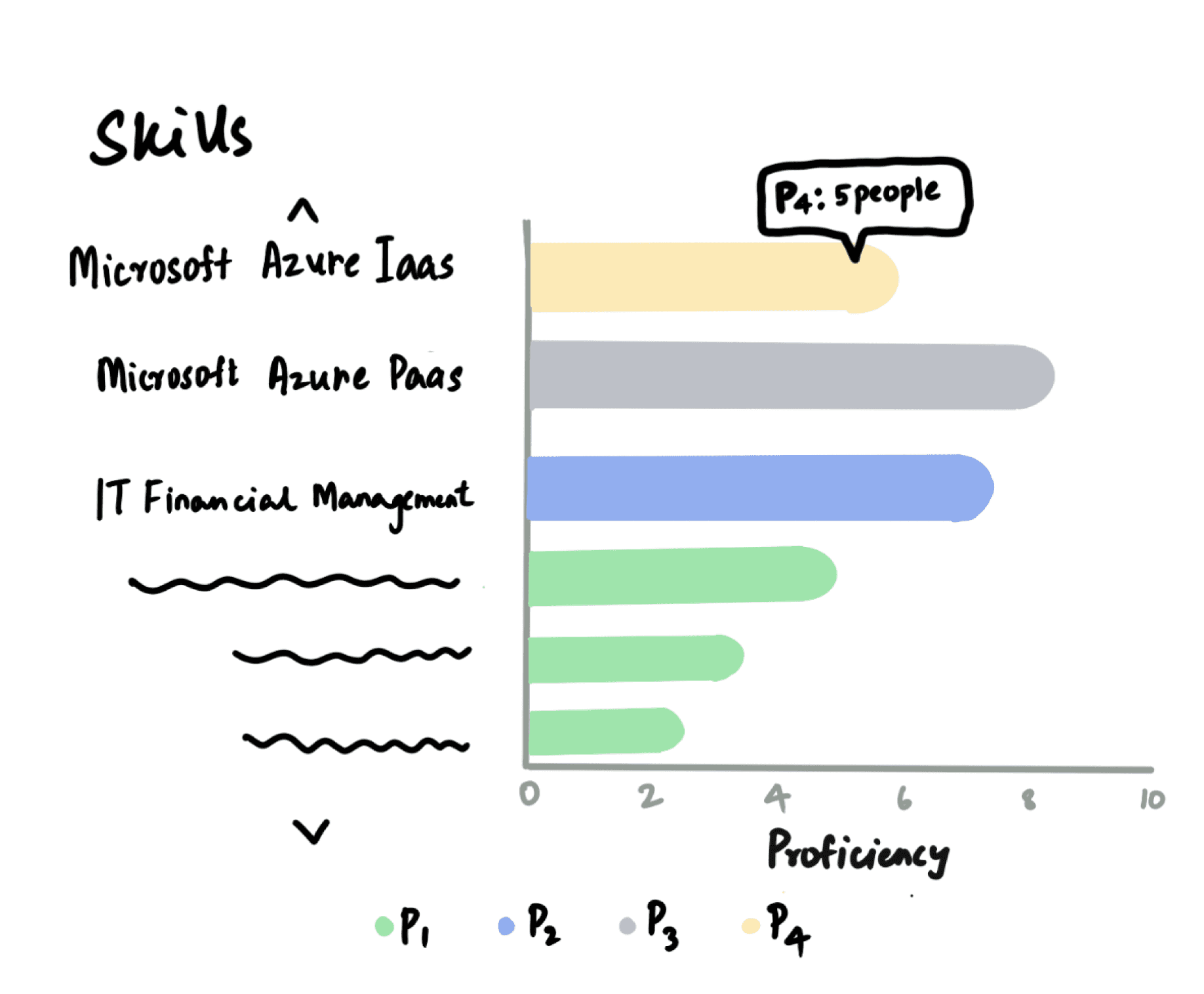
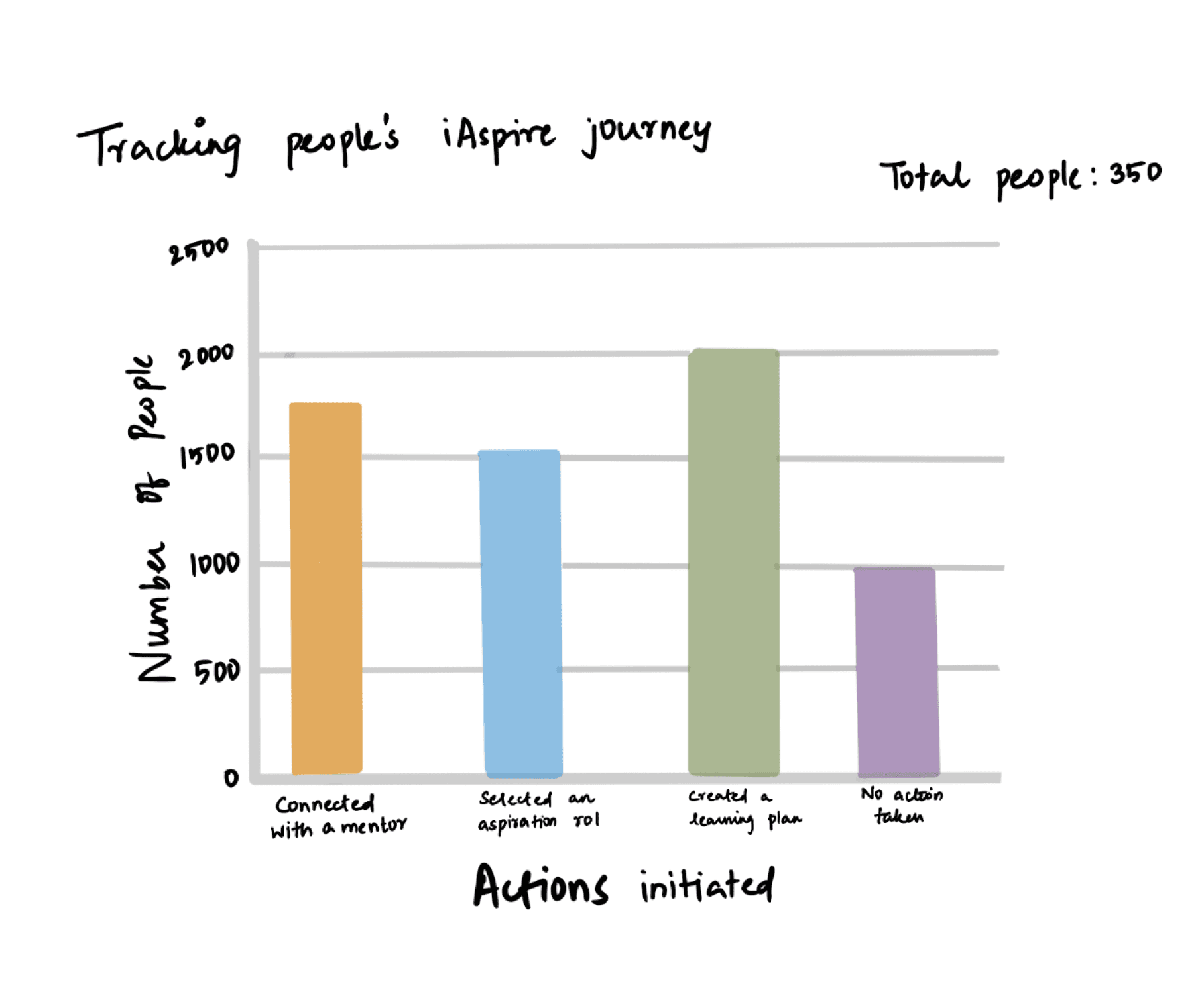
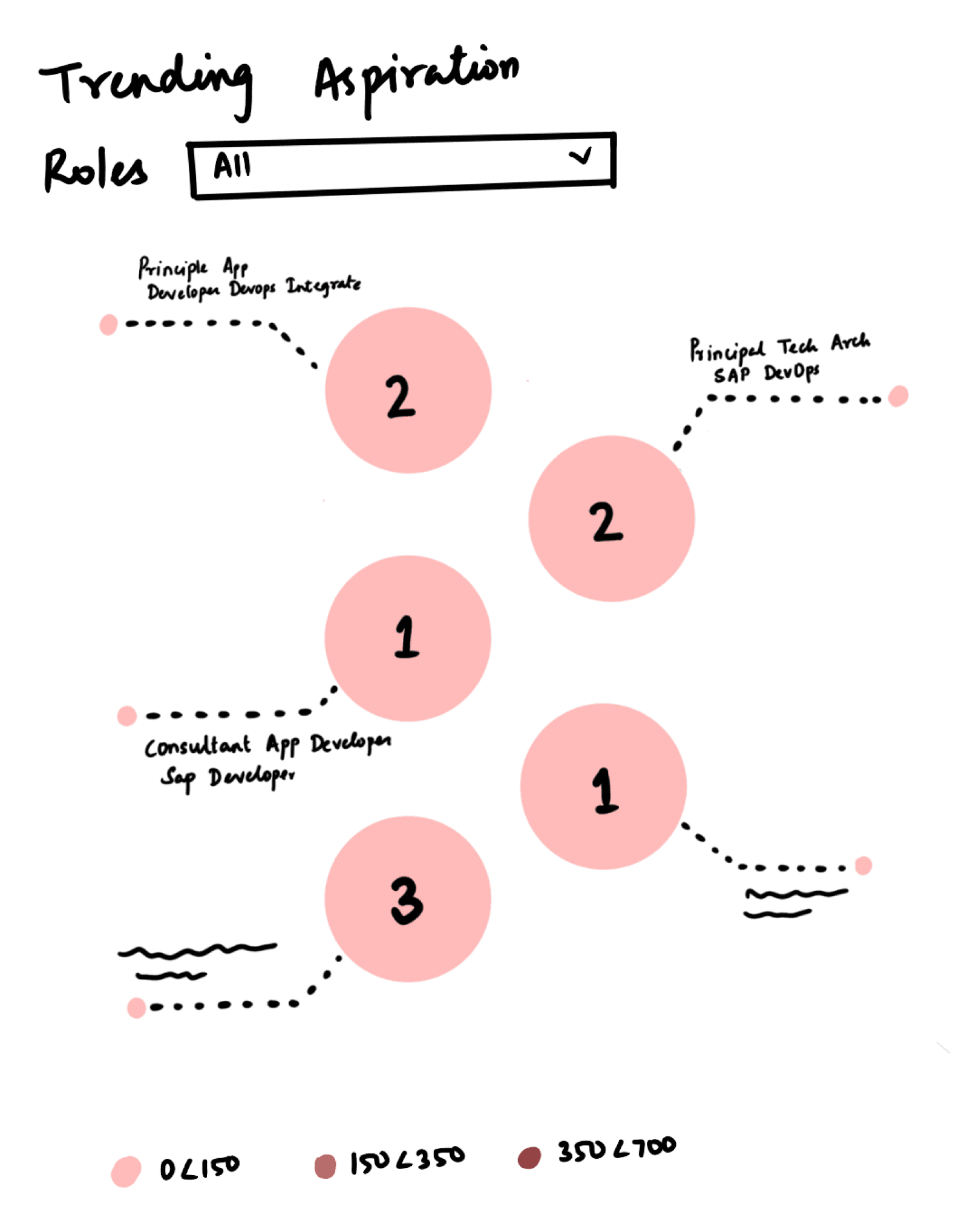
Some of the other charts I’ve developed using D3 charts:
REFLECTION
Effective collaboration between engineers and designers is crucial for successful design.
Designers benefit from having knowledge of coding.
Real time data should be considered while designing.
Other works
Exit


L2
L1


49 seconds Elevation


Nirvana Chamber
Impermanent Mudra Sculptures
Experience The Path of Suffering
Entrance
Let’s chat
Always happy to connect, brainstorm, or dive into
something creative together.
This website is best viewed on desktop
Madhumitha Manimaran © 2023.


